The Boston Housing dataset contains information about housing in the suburbs of Boston. The data includes 13 features, such as crime rate, the average number of rooms per dwelling, and the pupil-teacher ratio, as well as the target variable MEDV, which represents the median value of owner-occupied homes in $1000s.
In order to understand the relationships between the features and the target variable, we can use scatter plots. A scatter plot is a visualization tool that displays two variables as points on a graph. The position of each point represents the values of the two variables. This allows us to see if there is any correlation or relationship between the two variables.
To create scatter plots for each feature in the Boston Housing dataset, we can use the following code:
import pandas as pd
import numpy as np
import matplotlib.pyplot as plt

# load the data
df = pd.read_csv('boston_house_price.csv')

# create a figure and axis for the scatter plots
fig, axs = plt.subplots(13, 1, figsize=(25, 100))
axs = axs.ravel()

# plot each feature against the target variable
for i, column in enumerate(df.columns[:-1]):
    axs[i].scatter(df[column], df["MEDV"])
    axs[i].set_title(column)
    axs[i].set_xlabel(column)
    axs[i].set_ylabel("MEDV")

    # calculate the slope and intercept of the line of best fit
    slope, intercept = np.polyfit(df[column], df["MEDV"], 1)
    x = np.linspace(df[column].min(), df[column].max(), 100)
    y = slope * x + intercept

    # plot the line of best fit
    axs[i].plot(x, y, '-r')

plt.show()
The first thing we do is load the data from the CSV file using pandas. We then create a figure and axis for the scatter plots using the subplots function. We set the size of the figure to 25 by 100 inches, and use the ravel function to convert the axis object into a 1D array.
We then loop through each feature in the dataset (except for the target variable), and create a scatter plot with that feature on the x-axis and the target variable MEDV on the y-axis. We also set the title, x-label, and y-label for each plot.
To visualize the relationship between the feature and the target variable, we also calculate and plot a line of best fit. This is done by calculating the slope and intercept of the line using NumPy's polyfit function, and then creating a range of x-values using NumPy's linspace function. We then calculate the corresponding y-values and plot the line using Matplotlib's plot function.
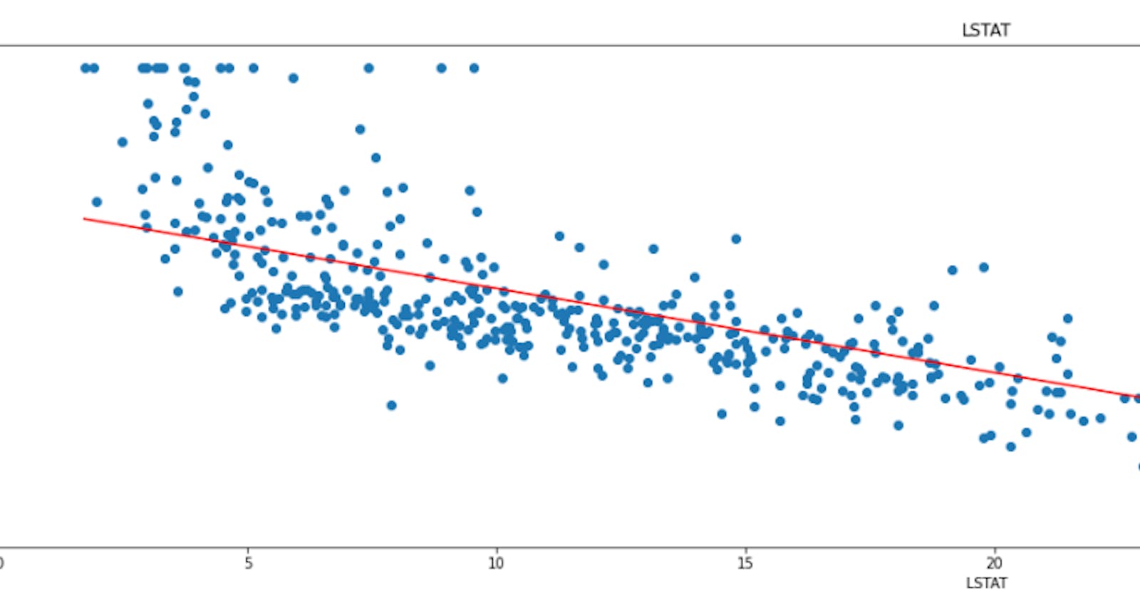
When we run this code, we get 15 scatter plots, each showing the relationship between a feature and the target variable MEDV. Here's what it looks like:

From these scatter plots, we can see that there are some features that are strongly correlated with the target variable, such as RM and LSTAT. We can also see that some features have a weak or no correlation with the target variable, such as ZN and CHAS.
In conclusion, scatter plots are a valuable tool for visualizing the relationships between features and target variables in a dataset. With Python, we can easily create scatter plots for each feature in the Boston Housing dataset and gain insights into the data.

